


Sunday, 9 October 2011
Supergirl #1

- Supergirl #1
- Batgirl #1
- Legion Lost #1
- Legion of Super-Heroes #1
Judging a Book by its Cover
There were a few things I noticed on the cover. The glaring one is that Supergirl's logo has not changed as so many others have. Of course, I say Supergirl's logo its the Superman logo saying Supergirl. I feel that this was an opportunity missed to show Supergirl's uniqueness and independance. Its a little thing but its the first thing people see. You may as well write in big letters, 'she's Superman as a teen girl'. I was never a fan of this logo and would prefer some update of Supergirl's old 70's and 80's logos if not a whole new one.
 |
| Turner's Supergirl #1 was striking |
The cover image itself is striking but its not one of Asrar's best covers. Its not as impactful as Turner's Supergirl #1, those piercing eyes stared down the reader. Kara was powerful in that cover and all it was was a portrait. The concept behind Asrar's cover is solid but Kara looks a little awkward and static. She isn't the dynamic figure, the background is. The other problem is the face which is a little old for the character and has led people to believe she's Powergirl as has the hair. Supergirl has sported short hair for a year or so now, she first appeared in 1959 with the same length hair.
Costume Conundrum
The costume has caused much debate. I like it. Its a little wacky and if Supergirl can't wear a wacky costume who can? Much like my dislike of the logo on the book being the same as Superman's Supergirl's actual S logo is a lot edgier and alien. I can only assume this came from January's logo covers where they realised Supergirl and Superman's were the same and so they gave us a pink monstrosity. Supergirl's logo looks like an S but at the same time clearly isn't our S.
 |
| Supergirl has always changed to reflect modern trends |
 | |
| Going back to a basic look |
This costume was designed by Jim Lee.
Asar-some!
 |
| Previous logos have been slightly different |
Like I said, for all the softness of the first five pages we get lots of harsh lines in the middle of the action and for the simplicity of standing in the snow we get the the heaviness and clautrophobia of Supergirl getting her super-hearing. That page looks like manga.
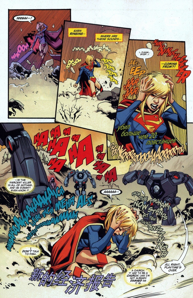

I thought that was very interesting considering the large female readership of manga. If this gets girls to read Supergirl I'm all for it. I have nothing against the style. It works in this moment. My favourite page has to be the one I used in the opening of the review. Its stunning and I can't help but think that it should have been the cover or at least a variation on it. While the image of Kara in space is eyecatching I don't think it will be as iconic as this image of Supergirl clawing her way out of the snow. The white of the snow just works to bring out the costume.
Two writers, Twice as nice or Too many cooks?
This issue was written by Michael Green and Mike Johnson. No, I can't tell them apart either! Its been accused of being short and it is. The writers are relying on the artist to set this series off with a bang. Its a giant spectacle and I like that. Start with Kara showing us her stuff. People read super-hero comics for superheroism and action. Its the personal journeys that make the action pop. Its Supergirl's inner monolgue that serves as the emotional thread and its a subtle piece of writing. Kara can't speak English which is going to make later issues tough if she doesn't display her super-intelligence to learn it quickly. Could the next issue feature Supergirl and Superman talking entirely in Kryptonian? (Translated for our benefit of course) There is a distinct difference between the Loeb introduction and the Green/Johnson introduction; it is from Supergirl's point of view. Loeb presented Kara as a mystery, the kryptonian alphabet was alien and distanced us from her as much as the characters in the story. Here, there is no kryptonian alphabet as we are firmly seeing this from Kara's perspective. This origin is hers, not a stimulus for Superman and Batman's conflicting points of view.
Another criticism is that we don't know much about her which is true but we know enough for issue one without the narrative becoming completely exposition. We we learn over time and as comic readers we don't have much patience. Can we be blamed, we get 240 pages a year. Only 12 issues. Once a month. Things have to move quickly with the illusion of moving slowly for the character. However, for one issue we find out a lot about who she is and what kind of life she has come from:
- She's a daddy's girl. She talks more about him than her mother and with more affection.
- Her mother was the disciplinarian in the family. Her father was more fun and encouraging.
- For some reason she wonders that she might not graduate. She's either a poor student or not committed to studies.
- She left Krypton in the middle of Zod's latest scheme.
- She punched the robot before she knew she had super strength. She's no damsel.
Its a more subtle way of having a character say 'I am' or 'I did'. Remember, she's talking to herself here. She doesn't need to tell herself who she is. Its through what she thinks we find out who she is. Next issue is probably when we get the more nitty gritty when she has to explain who she is to Superman who has no clue, like us.
Finally, we can see the inspiration from Supergirl: Cosmic Adventures in the 8th Grade which heavily relied on the character's 'interior' monologue through daydreams. This is the girl who misses her mother and father and who just wants to go home, she's confused and lost and can see naked people! The whole tone screams of a more mature version of this character. Then there are the little bits like Supergirl in Cosmic Adventures shows up on Earth in her S shield band costume, Supergirl in #1 shows up in her S shield graduation costume. Now, if the humour translates we are onto a winner!
The Summation
I give Supergirl #1 :

3 Streakys out of 5
I hold out hope that she won't be so alienated and isolated that she isn't likeable. That experiment failed back with Loeb.