


Tuesday 18 October 2011
Batgirl #1 Review
 |
| Hughes toned down the mass of red hair |
Barbara Gordon has never had a solo ongoing as Batgirl or Oracle.
Staggering considering she is one of the most popular characters at the company. She has live action television and cartoon credits, dolls, t shirts and posters but never an actual monthly comic in her name.
Lets start with the cover. Batgirl gets a great new logo in her trademark yellow. Its similar to the Batman logo but has its own character based on what we know of this character. Another thing to notice is how the yellow typography will always tie in to the yellow on Babs' outfit so the chances of it looking out of place in the colour scheme is slim.
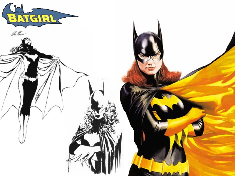 |
| Alex Ross designed the definitive Batgirl |
 |
| Yvonne Craig's Batgirl is a visual touchstone |
comics would draw people with black hair with blue highlights, creating shadow with total black is very hard. The DCAU Batgirl shares this design and gives her a smaller blue toned cape and cowl. The Batgirl of 'The Batman' inverts this and uses a purple body suit with a black cowl and cape. In the Batman TV show of the 60's Barbara wore purple but then so did Batman. Yvonne Craig has an irreplacable stamp on the character's image. She is clearly the face model for Ross' Batgirl (as Helen Stater is his Supergirl). This is why Jim Lee replaces the yellow undercape that would turn his design in to an almost direct lift of Ross' purple. It goes to show how just how little it takes to detract from an iconic image. Its all down to simplicity. There is an unneeded third aspect of the design here. Also new is a purple bat dongle around her neck which thankfully is not to be seen inside. Is it a zipper?
 |
| The Jim Lee/Cully Hamner design page. |
Busy, Busy drawings
Despite all by hate for the costume, inside its not so bad and that is probably because Syaf shares a similarly busy style with Lee and because the colourist and letterer came together well. How can all this help the costume you say. Syaf's lines are incredibly detailed so the fact the costume is a mass of texture and colour blends in well. The colourist can be credited because he uses the purple as a statement rather than the yellow so the two bold attention pieces in the costume rarely conflict. The text boxes provide a unifying purple so that even when Babs' cape is the only purple on the page it doesn't feel so out of place.
 |
| Oracle looking glam |
A Woman Writing a Woman, What Could Possibly Go Wrong?
Compared to Supergirl #1 a lot of things happen in this issue. As was said, Babs is constantly on the move. There are two threats in this issue she has to deal with. Now, here's the elephant in the room. Babs keeps moving after spending two decades (our time) in a wheelchair. I've even read people accuse the issue of flaunting her legs after her injury. I always wanted Barbara back as Batgirl for the very reason I outlined up top. She is one of the most popular women in DC Comics but has never had a solo series. It was Barbara who made the character of Batgirl and there hasn't been a Batgirl since who hasn't had to deal with Barbara in some way because where Batgirl is we expect Babs. For Warner, she is Batgirl. She sells everything but a comic book. Yet its her legacy that has helped sustain both the Cass Cain and Steph Brown incarnations of the character but she never had that kind of glory or focus for herself. If she was ever going to get that level of focus she had to walk again. Oracle is fine for a Birds of Prey team where Huntress and Black Canary can do the physical requirements of a superhero tale but in the long term it would take some hefty imagination to make an Oracle ongoing. The nearest we got was Grant Morrison's idea of a cyber Batgirl but in the end why not just have Batgirl back herself? For all those who say she is a representative of disable people in our world I say, surely now she is a representative of all those who have to recover from trauma and injury only to find they can't go back to normal? This is a character under contant evolution and she means something to everyone.
As for what we read in the actual issue as a number one of the new 52. Gail Simone shows us Batgirl on a standard mission to rescue a family from masked killers. Perfect for a new number one. Its your highest selling issue of the whole series and needs to set the tone. You need to show the reader what the character is about and this is the perfect way. You are out the gate showing her being incredible and amazing. We see that Barbara is a character with a great sense of humour. Batgirl in a lift on her batcycle asking the confused occupant to 'be a lamb and hit the button for the fourteenth floor' is hysterical. We are introduced to her supporting cast with her father and new room mate. The status who is set up, Barbara will be trying to hide her nightly activities from her suspicious friend. Then there is the emotional and character thread. Babs has had a near miss and is terrified of it happening again. She can walk again and that means she has gained more freedom, taken further by her moving out of her father's home.
Synopsis

Three Streakys out of Five
Its a more enjoyable read if you can accept that this is a new start for the character and embrace it. If you want to find things to hate on principle you will. As it is, its a fun comic with good setup and hints of a deeper character drama to unfold.